Here is the original pencil grid for this piece. As you can see I had no clue what I was doing. HA! What I was trying to do and what I achieved were two different things all together. I wanted to do a large flower of life, but this is what came out. I decided to just move on with this design, at least the best way I could.
After I inked the first layer, I immediately liked it. I felt like it brought to life the sort of design I was looking for. Continuing on, I started to add more details and at least get this first smaller flower designed completely.
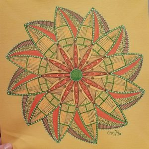
It was a big difference for me to NOT use black as an outline because that is sorta the color I lean on most. I used three colors here: orange, green and purple. Each of these colors nicely built on the last and the full design became clear. I saw movement and I knew that I wanted the outer flower to reflect this movement in contrast.
Once the outline was complete of the outer petals, I started to add more details within them to bring the colors all the way out to the end. It was at this time that I also wanted to add my white gel pen details. As soon as I stepped back from this, I was shocked that it had made it this far, unplanned.
I finished it all off with fine details and erasing all the grid lines. I would love to know what you think about the finished project and what was your favorite part of its creation!


You must log in to post a comment.