Annual Mandala Collections

I did want to take the opportunity to say thank you to all of you that have stayed loyal throughout the years. Although this site is only a year old, I have been working on bringing content to you for several years. I really do enjoy being creative every day, and I love even more to share it with all of you.

Each year, I have decided that I am going to create a Mandala Collection that can be sold as individual prints, or as a set of 3 or 5 mandala prints. I have done this for two years in a row and I am gearing up for my third year. But before I dive into that, I thought we would go take a look at the two previous years so that you can see what I am talking about first hand.

Mandala Collection I – 2017

Take a look at the posts for each one below, it will give you an insight into what was going through my head while creating them. This was my first year and I was not sure of how well I would do, or if this challenge would be too much for me. The theme of the first year was using black and white on gradient paper. These pictures do not show true justice for the design, but I promise you they look better in person.

Mandala Collection I, Mandala 1

Mandala Collection I, Mandala 2

Mandala Collection I, Mandala 3

Mandala Collection I, Mandala 4

Mandala Collection I, Mandala 5

Not too shabby for my first collection, if I do say so myself. I learned a lot of things throughout the year and was able to adapt the second collection into something a little different, and yet similar.

Mandala Collection II – 2018

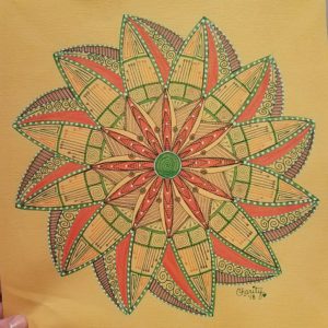
The theme for the 2018 year was using mixed media and triangles. Each mandala has an organic feel to them and yet each one is adorned with sharp edges. This collection also looks better in person, and as soon as I can get a studio area set up with great light, I will take better pictures to share with you.

Mandala Collection II, Mandala 1

Mandala Collection II, Mandala 2

Mandala Collection II, Mandala 3

Mandala Collection II, Mandala 4

Mandala Collection II, Mandala 5

Mandala Collection III, 2019 – Coming Soon!

I would love to know what theme you would like to see in the new collection. Don’t be shy, I never throw an idea away. Comment in the section below! I look forward to hearing from you!

Mandala Collection II, Mandala 5

WE MADE IT! The final mandala in the collection is complete and I can’t wait to share it with you. First off, If you would like to see the previous mandala in the collection, visit the link below.

Mandala Collection II, Mandala 1

Mandala Collection II, Mandala 2

Mandala Collection II, Mandala 3

Mandala Collection II, Mandala 4

You may also look in my YouTube Video which does a complete recap of the full collection and the progress from beginning to end!

Ok, so now let’s continue with the fifth and final mandala in this collection! First of all let me say that this mandala was inspired by my 100mandala community, who have been giving us great challenges to help us think outside the box.  This mandala was inspired by the triangle and circle progression. It was a lot of fun to make and very easy once you got the hang of it.

I have always loved the way that flowers with many petals look and feel when drawing mandalas. The two rows of petals gave this mandala a look that drew your eyes to either the triangles or the circles, even both. Take a glance at the picture below, which pattern do you see most. I fell in love with using the metallic paint markers, it was more of a matter of choosing the color I wanted. Of course, I chose silver.

Many of you know that a lot of my mandala are inspired by Zentangle and other patterns I see in the world around me., and this one was no different. I knew that I wanted to fill the empty spaces with an organic Zentangle pattern I have used before.

As soon as I finished the inner circle, I had to outline the outer circle as well. It was perfect! I saw the flowers, leaves, and vines beneath, all neatly tucked within this triangle and circle progression. Once it was all completed, I was very happy with it. This mandala is far out of my element, and yet I am very pleased with the relaxation techniques it taught me in the process.

What is your favorite part of this mandala? Be sure to check out the video and give your feedback as well.

Mandala Collection II, Mandala 4

Since the first flower of life sorta took a new turn, speaking about Mandala 2, I decided to try again. If you would like to see the first three mandala, You can see them by checking on the links below:

Mandala 1, Collection II

Mandala 2, Collection II

Mandala 3, Collection II

After you have taken a look at the previous three mandala, lets move forward to take a quick look at the fourth in this collection.

Now, that looks much better doesn’t it! I had to revisit some sacred geometry videos on YouTube to remind myself the correct way to actually draw the flower of life. After I completed the flower of life, I wanted to ad points all the way around to keep in with the theme of the collection, introducing the softer sides of triangles.

This is the point when I decided pink was most definitely the color of choice here. I do need to mention that I am using the Sepia Copic Collection for the lines. As you can tell, they are softer than my usual black. I was really trying NOT to use blick liners for this entire collection. The pink is a Tombow Dual Tip marker that filled the area perfectly!

I had two different shades of pink and they paired nicely. Since I had two shades of pink, I decided to do the same deal with the brown. The brown shading was done with a color pencil. I thought that it gave just a tiny little element that gave the whole thing dimension.  This is also where I decided to use some metallic paint pens I had. I wanted specific areas to pop out more than others, so I either outlined them or filled them in completely with the metallic pens. I used gold and rose gold throughout.

After seeing the finished project, I absolutely fell in love. it was my favorite. Maybe I chose these colors because I completed it in the month of February when love is in the air. Either way, I could not be happier with the results. What is your favorite part of this mandala? Do you have a favorite mandala in this collection so far? Let me know in the comments below!

Mandala Collection II, Mandala 3

Hi there! Coming at ya again with the third mandala in my Collection II. If you want to see the previous two mandala, you can visit the links below!

Mandala 1, Collection II

Mandala 2, Collection II

Now onto the third. This mandala was where I introduced some metallic paint and gel pens into my art. I hadn’t used these before and wasn’t sure of how they were all turn out. I never could get a picture that truly captured the beauty of this but you’ll see what I came up with at the end.

In this picture, YOu can really see both of the new mediums well. I used blue, gold and white to create this look. I ended up stopping here for almost 2 days. I had no feelings on how to finish it, and I work completely on feelings. Sometimes I know that I need to take a break, step back, and rethink what I want to achieve.

This is the same progress shot, just at a different angle so you can appreciate the metallics a little better! I truly did love this mandala and where it was headed. I looked at the progress photos over the following days to truly capture the essence of the mandala’s finale’.

I’m putting this shot in there to show you that the lighting downstairs in my basement made this look completely green. I was amazed at how discolored it was, but this was a first look at my finished project. Now onto the picture that I took in daylight, which shows the true colors and even gives you glimpses of the different mediums use.  I bring this up to show you that lighting can make a huge difference when you present your final photography of your art. I have found that natural daylight is, hands down, the best lighting. Make sure you experiment with different types to achieve the look you are going for.

There it is! The final picture. It still doesn’t do the original justice, but overall, I really like the way it photographed in the daylight. What kind of lighting do you use with your art and have you found anything that makes your photographic art most true to the original? Let me know in the comments below!

Mandala Collection II, Mandala 2

Here is the original pencil grid for this piece. As you can see I had no clue what I was doing. HA! What I was trying to do and what I achieved were two different things all together. I wanted to do a large flower of life, but this is what came out. I decided to just move on with this design, at least the best way I could.

After I inked the first layer, I immediately liked it. I felt like it brought to life the sort of design I was looking for. Continuing on, I started to add more details and at least get this first smaller flower designed completely.

It was a big difference for me to NOT use black as an outline because that is sorta the color I lean on most. I used three colors here: orange, green and purple. Each of these colors nicely built on the last and the full design became clear. I saw movement and I knew that I wanted the outer flower to reflect this movement in contrast.

Once the outline was complete of the outer petals, I started to add more details within them to bring the colors all the way out to the end.  It was at this time that I also wanted to add my white gel pen details. As soon as I stepped back from this, I was shocked that it had made it this far, unplanned.

I finished it all off with fine details and erasing all the grid lines. I would love to know what you think about the finished project and what was your favorite part of its creation!


Mandala Collection II – Mandala 1

Okay, So I know that we are on our second collection of mandalas and I wanted to share them with you here first hand so that you can see the progress as it happened. I have been so busy with life lately that I have failed to update my blog as often as I should. Hopefully, with the arrival of my new bullet journal, I will get back on track.

So without further ado.

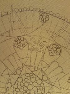
Are you excited yet? When I first started this mandala, it was very late and I was just trying to get something down on paper after having such an off year already. My original plan was way different from what it turned out to be. So like with every mandala, I drew my gridlines and basic line work for my idea. As I was doing this, however, I found that what was in my head was not coming out on my paper.

Looking at this shot, you can see the beginning of this creation. This is the point where I thought that using the circles as if they were a plant or organism was the key to getting this mandala off the ground. I quickly got stuck on what would go between the circles without it looking too busy. What goes better with weird orb-like flowers than tentacles?

After I played around with this look in pencil, I inked it in and added just a pop of color. Adding this color just blew my mind and gave me the inspiration I needed to continue on. What do you think so far?

The gradient was really cool and making the orbs a darker green was the best thing I could do to really make them noticeable. After I got all the orbs colors, and boy were there a lot of orbs, I moved on to the petals. I knew that I could not make this whole thing green because then certain features would wash out. So that’s what I opted for my second color to come into play! Orange!

That was it, I knew I was well on my way to completing one of my favorites to date! It was so unlike every other mandala I had seen and it was my own creation. Am I getting you excited yet?

After adding white gel pen and yellow color pencil, that was it, I knew that it was complete. The one thing I always do is sign my artwork on the lower right-hand side, but only if it is complete. I would love to know what you think about this first mandala. Once the collection is complete, I will get scans of them so you can see the true color in each one.