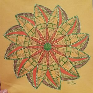
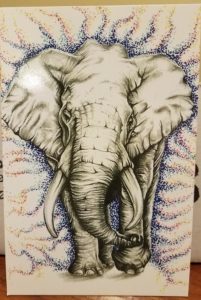
Annual Mandala Collections

I did want to take the opportunity to say thank you to all of you that have stayed loyal throughout the years. Although this site is only a year old, I have been working on bringing content to you for several years. I really do enjoy being creative every day, and I love even more to share it with all of you.

Each year, I have decided that I am going to create a Mandala Collection that can be sold as individual prints, or as a set of 3 or 5 mandala prints. I have done this for two years in a row and I am gearing up for my third year. But before I dive into that, I thought we would go take a look at the two previous years so that you can see what I am talking about first hand.

Mandala Collection I – 2017

Take a look at the posts for each one below, it will give you an insight into what was going through my head while creating them. This was my first year and I was not sure of how well I would do, or if this challenge would be too much for me. The theme of the first year was using black and white on gradient paper. These pictures do not show true justice for the design, but I promise you they look better in person.

Mandala Collection I, Mandala 1

Mandala Collection I, Mandala 2

Mandala Collection I, Mandala 3

Mandala Collection I, Mandala 4

Mandala Collection I, Mandala 5

Not too shabby for my first collection, if I do say so myself. I learned a lot of things throughout the year and was able to adapt the second collection into something a little different, and yet similar.

Mandala Collection II – 2018

The theme for the 2018 year was using mixed media and triangles. Each mandala has an organic feel to them and yet each one is adorned with sharp edges. This collection also looks better in person, and as soon as I can get a studio area set up with great light, I will take better pictures to share with you.

Mandala Collection II, Mandala 1

Mandala Collection II, Mandala 2

Mandala Collection II, Mandala 3

Mandala Collection II, Mandala 4

Mandala Collection II, Mandala 5

Mandala Collection III, 2019 – Coming Soon!

I would love to know what theme you would like to see in the new collection. Don’t be shy, I never throw an idea away. Comment in the section below! I look forward to hearing from you!

Mandala Collection II, Mandala 5

WE MADE IT! The final mandala in the collection is complete and I can’t wait to share it with you. First off, If you would like to see the previous mandala in the collection, visit the link below.

Mandala Collection II, Mandala 1

Mandala Collection II, Mandala 2

Mandala Collection II, Mandala 3

Mandala Collection II, Mandala 4

You may also look in my YouTube Video which does a complete recap of the full collection and the progress from beginning to end!

Ok, so now let’s continue with the fifth and final mandala in this collection! First of all let me say that this mandala was inspired by my 100mandala community, who have been giving us great challenges to help us think outside the box.  This mandala was inspired by the triangle and circle progression. It was a lot of fun to make and very easy once you got the hang of it.

I have always loved the way that flowers with many petals look and feel when drawing mandalas. The two rows of petals gave this mandala a look that drew your eyes to either the triangles or the circles, even both. Take a glance at the picture below, which pattern do you see most. I fell in love with using the metallic paint markers, it was more of a matter of choosing the color I wanted. Of course, I chose silver.

Many of you know that a lot of my mandala are inspired by Zentangle and other patterns I see in the world around me., and this one was no different. I knew that I wanted to fill the empty spaces with an organic Zentangle pattern I have used before.

As soon as I finished the inner circle, I had to outline the outer circle as well. It was perfect! I saw the flowers, leaves, and vines beneath, all neatly tucked within this triangle and circle progression. Once it was all completed, I was very happy with it. This mandala is far out of my element, and yet I am very pleased with the relaxation techniques it taught me in the process.

What is your favorite part of this mandala? Be sure to check out the video and give your feedback as well.

Mandala Collection II, Mandala 4

Since the first flower of life sorta took a new turn, speaking about Mandala 2, I decided to try again. If you would like to see the first three mandala, You can see them by checking on the links below:

Mandala 1, Collection II

Mandala 2, Collection II

Mandala 3, Collection II

After you have taken a look at the previous three mandala, lets move forward to take a quick look at the fourth in this collection.

Now, that looks much better doesn’t it! I had to revisit some sacred geometry videos on YouTube to remind myself the correct way to actually draw the flower of life. After I completed the flower of life, I wanted to ad points all the way around to keep in with the theme of the collection, introducing the softer sides of triangles.

This is the point when I decided pink was most definitely the color of choice here. I do need to mention that I am using the Sepia Copic Collection for the lines. As you can tell, they are softer than my usual black. I was really trying NOT to use blick liners for this entire collection. The pink is a Tombow Dual Tip marker that filled the area perfectly!

I had two different shades of pink and they paired nicely. Since I had two shades of pink, I decided to do the same deal with the brown. The brown shading was done with a color pencil. I thought that it gave just a tiny little element that gave the whole thing dimension.  This is also where I decided to use some metallic paint pens I had. I wanted specific areas to pop out more than others, so I either outlined them or filled them in completely with the metallic pens. I used gold and rose gold throughout.

After seeing the finished project, I absolutely fell in love. it was my favorite. Maybe I chose these colors because I completed it in the month of February when love is in the air. Either way, I could not be happier with the results. What is your favorite part of this mandala? Do you have a favorite mandala in this collection so far? Let me know in the comments below!

Mandala Collection II, Mandala 2

Here is the original pencil grid for this piece. As you can see I had no clue what I was doing. HA! What I was trying to do and what I achieved were two different things all together. I wanted to do a large flower of life, but this is what came out. I decided to just move on with this design, at least the best way I could.

After I inked the first layer, I immediately liked it. I felt like it brought to life the sort of design I was looking for. Continuing on, I started to add more details and at least get this first smaller flower designed completely.

It was a big difference for me to NOT use black as an outline because that is sorta the color I lean on most. I used three colors here: orange, green and purple. Each of these colors nicely built on the last and the full design became clear. I saw movement and I knew that I wanted the outer flower to reflect this movement in contrast.

Once the outline was complete of the outer petals, I started to add more details within them to bring the colors all the way out to the end.  It was at this time that I also wanted to add my white gel pen details. As soon as I stepped back from this, I was shocked that it had made it this far, unplanned.

I finished it all off with fine details and erasing all the grid lines. I would love to know what you think about the finished project and what was your favorite part of its creation!


Christmas Presents!

I know I know! Christmas is already over, but now that all the gifts that I made have been well-received I thought I would share them with you. Each year I love to give gifts that I have created. I love to create something that makes them think of me and the memories we have together when  they see them. They are also personalized so that they meet the needs of the person and their tastes.

Ok, I want to start off with one of my favorite type pieces. A very dear friend of mine went through a tough time and didn’t believe that they would get through it. However, after they rose from the ashes of that destruction, we started to talk about how they were like the Phoenix. Every year, I give this friend something that goes along with the theme of rising above your circumstance and setbacks. Each year is a new beginning. You can check out last years here. And the one for this year was a beautiful staff, since we are both nerds, that is designed after the Phoenix.


This was drawn with my black .03 Staedtler Pigment Liners, and colored with red, orange, yellow, grey and brown Steadtler Color Pencils. I then decided that taking the grey color pencil and rubbing it lightly over the outer edge of the paper gave the whole thing a new look. Overall, I’m happy with how this turned out and have already started researching phoenix ideas for next Christmas. If you have any ideas, I would love to hear them.

Onto the second gift, I was gifted a smaller lazy susan. It was made from bamboo, but had some apples painted on the top of it.  I wanted to do something very personal for my sister-n-law and her new husband. I knew that they would appreciate a handmade gift. So, I had my fiance’ sand down the top and it left a beautiful finish. Then, I started working from the inside out. Starting with the first letter of her new last name, “S.”

After surrounding the monogram with a very detailed mandala, I then erased my guidelines (still in the picture above) and put two clear protective coats on it. On the night we gave this gift, It was immediately put to use under the salad bowl in the center of the table.

The last, but certainly NOT least, gift that I made personally, was for my fiance’s parents. They have been such a wonderful blessing in my life and I wanted to give them something that represented family and unity. So, like the last gift, I chose to do a monogram again, but with my fiance’s parents last name letter “L”. But unlike the last gift, I chose to paint this on a black square canvas that I had.

I decided that using my gold paint pen from my table project gave this piece the life it was searching for. I absolutely love how it turned out and they seemed to as well. I am truly blessed to be able to share my talents with those around me.

Although these were not the only gifts I gave for Christmas, they were the most personalized gifts and I wanted to share them with you. Please let me know in the comments below, which was your favorite and why. I would also love to know any ideas you may like to see in the future.

Playing around with watercolors!

I just wanted to let everyone know that I have a new video on YouTube, where I have chosen to play around with watercolor pencils that I got from a Sketchbox. I was super excited to get my camera for Christmas so that I could make these videos for you. Note that this actually took me about an hour to draw, but I sped up the video x8 so that you guys didn’t get bored. It also made me realize just how slow I draw! Slow and steady win the race I guess.

If you would like to see the video, check out out below. If the video doesn’t show up, you can also click here.

I would love to know what your thoughts are on this video and what you would like to see more of in the future!

[amazon_link asins=’B001XCWP34,B000F56QDA,B00A37UU2S,B00WVDKS56,B01FLUICIA,B0007OEE7E,B009CQKL3Y,B0007OEDYI,B01CNYZ35C,B000JTMCO4′ template=’ProductCarousel’ store=’rafrti-20′ marketplace=’US’ link_id=’b59e1bf5-f61a-11e7-ad9e-0bfe54d4c943′]

August Zen Art Challenge – Days 1 – 5

As you may be aware, this is my second month doing the Zen Art Challenge created by Mindful Creativity.  I wanted to push myself to think outside the box and do something a little different with this month. I have decided to make a mandala out of each five day span. Below is a link to the first five days of this challenge. It takes you to her Pinterest board, where she keeps track of these.

Day 1 – WELL – https://www.pinterest.com/pin/45247171239206499/

Day 2 – Ausheklis – https://www.pinterest.com/pin/45247171239206511/

Day 3 – Patience – https://www.pinterest.com/pin/45247171239206538/

Day 4 – Dragontail – https://www.pinterest.com/pin/45247171239206536/

Day 5 – CurlyCrown – https://www.pinterest.com/pin/45247171239206544/

Starting with day one I began in the center. I don’t like four petal flowers as I have stated before, but I know that part of the challenge, at least for me, is to use every pattern in a different way. So here is what I came up with. Can you see the progression of each day?

Please let me know if you like to see this type of challenge and which pattern you like most on this mandala in the comments below!

Bullet Journaling – Refresher

If you haven’t heard of bullet journaling, it is a minimalists way to schedule your life. This is a system that combines several of your journals, schedulers, and calendars into one easy to keep track of book. Or so they say. Now before you get offended, hear me out. I tried this system back in November of last year, you can read that post here, and I failed.  My failure had nothing to do with the system and more to do with my perfectionism. I wanted beautiful spreads and amazing visuals on each page. Eventually, it became too much with the holidays and I never made it to December. To be honest, I don’t even know where that notebook is currently.

Now, lets discuss why this system failed for me. There are several reasons, some of them mental and some of them physical. These range from not having the right notebook, to not making the time, and not putting forth the effort. “Oh, I don’t need to write that down, surely I will remember it!” Famous last words. I never did remember it and I never did write it down.

Excuse #1: Not having the right tools.

Now, don’t think that you have to have the most famous bullet journal or the most expensive pens and products to do a bullet journal. You just have to be happy with what you do have. You can just use a composition notebook and a bic ballpoint. You don’t need the fancy supplies to get started, and honestly, I wouldn’t go out and buy them until you have created the habit.

However, in my mind, I didn’t have the right supplies. I didn’t want to use the inexpensive supplies I had on hand because I have to get excited about a new habit, or it won’t form. If I don’t have crisp, clean notebook and a pen just for it, I won’t be happy long enough to continue.  So, I bought the Leuchitturm 1917, which is like the official bullet journal. I did not buy pens for this, because I already have my Staedtler Triplus Fineliners that I love and work perfectly.

[amazon_link asins=’B06XPP3SPX,B003EVLFJM,B002TSIMW4,B00SBDMNEE,B002CVAU1Y,B01N8ZXUX7,B003VZR1PI,B003EVHV6S’ template=’ProductCarousel’ store=’rafrti-20′ marketplace=’US’ link_id=’08a6aeb8-7160-11e7-9303-9bfd195b4d23′]

Excuse #2: I can’t make my spreads look like those on Pinterest

This is a very very common misconception. The spreads are beautiful, and one day, I will get there. But it is better for me to form the habit with the minimalist attitude. So, here is a picture of my year at a glance spread below. You will see that I just made it simple. I also added a thin piece of washi tape across the top, not even perfectly lined up *gasp*, so that i had a quick reference to jump back to. *personal information is blacked out*

I decided to only do 6 months because that would carry me to the end of the year. When the next 6 months arrive, if I am still doing bullet journaling, I will add it to it then another 6 month spread. Besides, who wants to get bogged down on trying to keep up with a full year at once. Guess what else? I only used black and white on this page. I want to get into the habit before I learn new ways to create the same spread. I highly recommend this way of thinking.

Excuse #3 – I don’t even know what I should track or that I want to track.

If you look online, especially Pinterest, you will find a huge list of trackers. But I say NAY! Don’t get bogged down with all the trackers available. Add trackers as you want to, and how you want to. Throughout the process you will find that you will come across things that are important to you specifically that you want to track. For me, I want to track my 100 mandala challenge! This challenge is important to me and something that I want to complete before the end of the year. Here is a look at how I am tracking this, in my 2-page tracker spread.

As you can tell, I drew  a simple mandala and also included the website where I got the challenge from. I then write a date on the number and color it in. This is my favorite spread so far. It appeals to my artistic side, as well as my need to track this challenge.

Excuse #4 – I’m too depressed/anxious about keeping up with something else.

Yes, depression and anxiety is something that we all have to deal with at one time or another. Some of us even struggle enough to be medicated. But that is what is so great about the bullet journal process, if you miss a day or a week, you can jump back in and there are no predetermined pages that you use up. You determine how and how much you use your bullet journal. I decided to try to list all the things that make me happy and put it at the beginning of my journal. This ensures that even on the days that are considered my lows, I have something to keep me from going under. Take a look at this below.

Excuse #5 – I’m too busy

Honestly, we are all too busy if we believe it, but the truth of the matter is, we can make time for anything! After planning out my first two weeks, I saw just how busy I wasn’t. I was too busy to add work, but not too busy to add fun. So I knew by looking at these two almost blank weeks, that I would see just how much time I really had to play with. Of course, I didn’t mark down all the ER visits and power outages and mom life with many many kids, but outside the home, I didn’t have much obligations. My next step is to track my hours, find out where everything goes. Check out these two weeks below. As you can tell, they are all really really simple.

So as you can tell, I didn’t want to do anything too crazy and I wanted to keep my trackers simple. At the beginning of each week, I also track my social medias. This shows me if I am doing a good job or if I need to work harder. Because I am just starting out, I feel like my numbers are embarrassing, BUT everyone has to start from the bottom.

I hope you enjoyed this walk through my bullet journal. Remember, you don’t have to wait until January 1st, to start. You can start in the middle of the month like I did. The objective is to start somewhere. Do you bullet journal? How successful are you with keeping it up. I would love to know your bullet journal experiences in the comments below!

Zen Art Challenge with Mindful Creativity – Days 15-22

Yay! We have reached week 3 in this months challenge. I know I am late posting this but life is crazy right now and I left this post in my drafts section. Normally I schedule the post and it works out great, however, this time I failed miserably at it. I had been trying my best to do only mono tangles, but as you can tell towards the end, I had to start combining them. Also, You might notice that I have eight days included instead of just seven. This is due to how I combined them. The fourth and final post will include all the tangles up into the end of the month. You won’t want to miss it!


Day 15 – ‘Unknown’

This border tangle looked way too snake-like for me, so I just went with it. I penciled in a log because I am just not sure if I am going to keep it or not. I felt like this tangle needed a background. Until I figure out what the background should be, I am just going to leave it penciled like this. What are your thoughts on a possible background? Let me know in the comments below, as I am always open for suggestions.

Day 16 – Breach

This is hands-down one of my favorites so far. Instead of doing each petal the same, I thought it would be wonderful to do a variation sampler of sorts. I love the way it turned out and how different each pattern came out. I embellished the ends with another tangle called beadlines. I think it finished it up nicely and complimented the main focus tangle.

Day 17 – Lacy, Day 18 – Jasmine, Day 19 – Deelish

I decided to mix all of these up into one mandala. How awesome did it turn out? You be the judge. I will say that I really enjoyed forcing myself out of my comfort zone with this one. Started the center out with Lacy. I decided to use stippling as the shading for the center of each square, I think that it gave it another dimension. The next layer is Jasmine. Now I will say that I did not like the examples of this tangle at all. it didn’t make sense to me as a grid pattern. It made more sense to me as a full circle or a border pattern, so I used it here. I did a little embellishing adding a single petal between each, but it worked out fantastically. Finishing it off with Deelish. This pattern is so versatile. I decided to bring the stippling out to the border to give the whole piece a finishing touch.

Day 20 – Strimonds, Day 21 – Zixts, Day 22 – Balloya

So as you can tell, I decided to do another combination piece. Combining tangles is always something that requires a little thought in how you want the finished product to look like.  In the very center, I decided to add the Strimonds as the centerpiece. This pattern is a great filler for most but it didn’t appeal to me, so I didn’t want much space to be covered with this tangle. I surrounded it with my rendition of Balloya. All of the examples have this pattern with three sides, however, I knew that I needed this to be the bulk of the piece. Finally, I decided to embellish the outer area with Zixts. Its such a fun tangle and worked well with Strimonds, as they looked very similar. All in all, I really can appreciate the color shading which brought a little, fun, into the piece as well.

I would love to know what your favorite tangle mentioned in this post was. Please let me know in the comments below.

[amazon_link asins=’1592538118,1574219049,1441316310,1454919027,B0008G8G8Y,1784941077,1574214276′ template=’ProductCarousel’ store=’rafrti-20′ marketplace=’US’ link_id=’b5e9365d-6c2c-11e7-a4f3-1765ebe97dec’]

July 2017 Premium Sketchbox

Every month, I receive a Sketchbox. This month, I have the premium box for $35 plus $5 shipping. The basic box is $25 plus $5 shipping. When you look at all the products inside, they all retail for around this. Now there are things that come every month, this includes; Sketchbox Sticker, Artist of the month box, Artist of the month tile, and a product description card. I will go through each of these items in detail below so that you can see what you get for the price. This is my second month getting it. If you don’t want to read this post, you can watch the video below of the un-boxing here.

In every box you get a special inspiration piece from the featured artist of the month. The artist creates something from everything that is offered in the box each month. You can read more about the Artists of the month by clicking here. This month we received this gem:

Ok, let’s get started on everything you get in the box and I will have pictures to give you a good look at each product. First off, let’s take a look at everything you get.

Staedtler Triplus Fineliner 10 set – $18.00

Custom Alumicolor Pocket Scale – $6.75

First Look – Derwent Precision .7mm Pencil – $9.99

2x Derwent Procolour Pencils – $2.89/ea

Sakura Microperm .45 mm – $2.79

Total Retail: $43.31

Staedtler Triplus fineliner 10 set – $18.00

“These fineliners offer a super fine 0.3mm porous point. which are protected from damage by a metal-clad tip which make them perfect for using with your new alumicolor pocket scale!” – Product Description Card

First off, Staedtler is like my go-to brand when I look for pens to create art with. Last year for my birthday, my now fiance’, purchased a set of 36 colors. Immediate I fell in love with all the colors and use these pens for anytime I want to add color. I also love to use them when coloring fine details because the time is the perfect size for that. In my opinion, you can never have too many of these pens and I am always excited when I see them in my hands.

CUSTOM Alumicolor Pocket scale – $6.75

“We partnered with Alumicolor to bring you this custom Sketchbox edition pocket scale! Alumicolor rulers are more than just functional pieces — they’re durable and beautifully designed professional tools. The scale itself is anodized into the ruler’s surface rather than being printed or etched, so that it never wears off.” – Product description card

This is a product that I haven’t ever used before, but I have an idea about what I want to do with it. Because it is so durable and comes with its own case, I thought this would be the perfect tool to add to my on-the-go art supplies that I like to keep with me in my purse. I pull out these supplies when I complete my Lunchtime Challenges and when I have a few minutes to create.  This is the perfect addition to that collection because of its size and the measurements at a glance.

Derwent Precision .7mm – $9.99

“We partnered with Derwent to give you the exclusive first look at their new mechanical pencil. The Precision Mechanical Pencil features a premium metal barrel and a high quality comfortable hold. This pencil is designed for detailed line drawing or technical work” – Product description card

I am always on the lookout for a good mechanical pencil.  I doodle a lot and typically I just use anything I can get my hands on, but that usually consists of a pencil that I need to sharpen, with the eraser worn down. This is going to be great for me because it is a very nice pencil. Holding in my hand, it has weight to it that tells me that the product is well built.  The weight is balanced and isn’t heavy on either side. I decided that I was going to tape the extra erasers to the extra lead that came with the pencil so that I always have them together.

Derwent Procolour Pencils – $2.89/ea

“The brand new Procolour range of colored pencils feature a strong pencil core with a smooth formulation and highly pigmented color laydown. These pencils offer increased blendability while maintaining a very strong core.” – Product description card

Being in America, the first thing I noticed is the spelling of color. I know that these color pencils are made in Britain so being spelled colour makes sense. That is just my ocd about spelling that comes out. Moving on, for these pencils to not come in a package, the tips were still fairly sharp, which makes me feel like they are fairly durable. I used them on some bright white cardstock so that I could see the colors and how they came out on paper and I’m pretty impressed with how the color on paper is extremely similar to the color on the pencil is what actually comes out on paper. As far as blending is concerned, these two colors aren’t the best and I wouldn’t typically blend them. So I wasn’t very impressed with the blending of these pencils.

Sakura Microperm .45 mm – $2.79

“Permanent micro-point ink pens that draw ultra fine lines. They will write on most surfaces, are quick drying and waterproof.” – Product description card

Sakura is a well known brand in the art world, especially if you know of zentangle practices. The various tips are so useful when trying to design different details. I tried writing with this on card stock and it didn’t skip wrote beautifully, however it did bleed. If I were to leave the tip in any place for any amount of time, it will create a circle that is bigger than the line.  I also wrote on the skin with this pen and it wrote perfectly. It didn’t smear or bleed out, the lines were really perfect.

All in all, I feel like this box was very much so worth the price of the premium subscription. Everything in this box is something that I will use in the future.  If you would like to get your hands on this sketchbook, or any in the future, please use this link so that I can get a credit to use towards next month’s box.

Lunchtime Challenge

This is something I just had to share. If you recall my latest Very Big Sketchbook post, you will notice that the flowers on there were something that I was playing around with. I decided that I was going to play a little more and see what I could come up with. This just might be my new favorite flower. I love how it seems like it’s spinning and adding the swirl to the very center completed the cycle.

I used Staedtler Pigment liners, .05 for the outline and .01 for the detail. I also completed this on an Artist Tile, which is about 3″x3″. The little squares are so perfect for my limited time over lunch!

I think I’m going to start keeping track of all these different flowers for reference. Do you have certain flowers that you like to draw? How do you keep track of them all? Tell me in the comments below!

Triple Mandala

I don’t really have much to say about these except that I tried a few different techniques while drawing them. I don’t have the exact dates when I finished them because it was over the weekend. So I will share them all with you now. The wonderful about each of these designs is that they are completely different and yet started with the same grids.  Each of them developed in their own way and in the direction of my mood.

#1 

#2 

#3

Which one is your favorite? Let me know in the comments below.

Floral Doodle

I watch this youtube channel called kcdoodleart, and it gives me so much inspiration.  Check it out if you would like to see the amazing work she does. She is the inspiration behind this piece. She always starts with a circle on the page and builds out from it. The simple fact that she can create something so amazing from just a circle just blows me away every time.


Sea Turtle Prompt

Well, I decided for the new year that I was going to be doing random prompts so that it forces me to think outside the box more. So, with the help of my dear friend, Sea Turtle was born. Here is a close up so that you can see some of the details.

One of these days I will be able to take better pictures of my art that is larger than 8.5×11. This one is 11×14. If you have any suggestions on how to take pictures of larger pieces, let me know in the comments below!

Gift – Teal & Blue

I have a dear friend who is in love with teal and blues. She is also an artist friend of mine and I knew that she would appreciate and one of a kind art piece for her home. I had so much fun drawing this and perfecting it. it was worth all the time and energy when I watched her reaction when she opened it.

I am so blessed to have people in my life that not only appreciate my artistic abilities but encourage them as well. This special lady is just one of those mentioned.  Here is a close up so you can see the detail and shimmer in the finished product.

Zentangle Sampler

So, I did it, I decided that I was going to take the patterns that I use the most and create a sampler page using just those. I started this by just drawing a bunch of circles. After I drew all the circles, I just decided how I was going to split it up based on the designs I wanted to incorporate.  The problem is that I don’t know these Zentangle names. So let me know in the comments below!

So far I have these added:

Paradox

Fescue

Gift – Dolphin Mandala

What do you get for someone who you know loves dolphins and the color blue, but a dolphin mandala.  I love being able to share these projects now that Christmas is over. I wanted to add some special details so I added a few metallic pens to just give a little life to the dolphin itself.

What do you think about the finished product? Let me know in the comments below.

Sacred Mandala

This mandala was loosely based on Metatrons Cube from Sacred Geometry. Sacred Geometry is a very interesting topic as far as Mandalas go. There is way too much information for me to include in a single post, but that may be something I explore more in the future.
This mandala, specifically, was designed after Metatrons Cube, which is one of the vast designs within Sacred Geometry. Because it wasn’t perfectly measured out in the way it should be, I decided to name this one Sacred Mandala, because it is part of the Sacred Geometry shapes. It was one of my first attempts to create something from these shapes I have learned to love.
The fascinating thing about this is, I was drawing Sacred Geometry shapes before I knew that it was called that. I think it has to do with my sensitivity to the universe. I am naturally attracted to the mathematics created by our universe.

Bullet Journal

Well, creating a bullet journal is a fairly new concept. I decided to jump on the bandwagon because the perfectionist in me loves the idea. so I hope to add each month’s pages before I add my personal data to them so that you can see what I am up to artistically.

Most bullet journals start with a year at a glance. So here is mine, created over the next 15 months.

After this, I decided to add some writing prompts that will help me remember those things we miss daily with our kids.

Next, I wanted to add a few prompts to write about myself. This part is particularly important to me because of the recent death of my sister-n-law. Now we are trying to put together everything we can are about her for her son who will, undoubtedly, want to know about her one day. God forbid anything should happen to me, but should something happen, there will be some information here for my kids and family left behind.

Next, I looked over some thought provoking questions that I want to answer in this journal. So, I decided to write them all down and then as I answer them, I will write page numbers to correspond with the location of my answer for each.

So, beginning in November, I decided to give you a preview of that months starting page.


Have you ever started a bullet journal? How did you stay focused and keep it up? I would love to know your bullet Journaling stories in the comments below.

Pumpkin Spice

Another Zentangle sampler here. Just some of the tangles that I have really enjoyed using. What a better way to collaborate all the different patterns, than to join them together on a symbol of fall and thankfulness.

Let me know if you have seen any of these tangle patterns before and which are your favorite in the comments below.

Dealing With Loss

Those of you that have been following me may have noticed I have been MIA for a few days. The reason is because we lost my brothers wife tuesday night and we’ve been dealing with all of this.

I was working on this piece during my last conversation with her and when my brother called me in tears. Our family has been struck hard by loss with the passing of my grandmother Thursday morning as well.

I feel like this piece speaks wonders about each person is so complex and unique and yet we all entwine with those around us making each family a beautiful masterpiece.

Art is my life!

When you find something that touches your soul, you can’t help but grab onto it and never let it go. For me that is art. I have found something that I love and I don’t want to stop. There are so many health positive aspects of creating art.

So create something, anything. Grab some markers, pens, coloring pencils or crayons and create! I love the fact that I can create something so vivid and pleasing. The piece below reminds me of the princess and the pea. What do you see?

Tell me in the comments how you like to be creative in your life.