Annual Mandala Collections

I did want to take the opportunity to say thank you to all of you that have stayed loyal throughout the years. Although this site is only a year old, I have been working on bringing content to you for several years. I really do enjoy being creative every day, and I love even more to share it with all of you.

Each year, I have decided that I am going to create a Mandala Collection that can be sold as individual prints, or as a set of 3 or 5 mandala prints. I have done this for two years in a row and I am gearing up for my third year. But before I dive into that, I thought we would go take a look at the two previous years so that you can see what I am talking about first hand.

Mandala Collection I – 2017

Take a look at the posts for each one below, it will give you an insight into what was going through my head while creating them. This was my first year and I was not sure of how well I would do, or if this challenge would be too much for me. The theme of the first year was using black and white on gradient paper. These pictures do not show true justice for the design, but I promise you they look better in person.

Mandala Collection I, Mandala 1

Mandala Collection I, Mandala 2

Mandala Collection I, Mandala 3

Mandala Collection I, Mandala 4

Mandala Collection I, Mandala 5

Not too shabby for my first collection, if I do say so myself. I learned a lot of things throughout the year and was able to adapt the second collection into something a little different, and yet similar.

Mandala Collection II – 2018

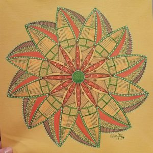
The theme for the 2018 year was using mixed media and triangles. Each mandala has an organic feel to them and yet each one is adorned with sharp edges. This collection also looks better in person, and as soon as I can get a studio area set up with great light, I will take better pictures to share with you.

Mandala Collection II, Mandala 1

Mandala Collection II, Mandala 2

Mandala Collection II, Mandala 3

Mandala Collection II, Mandala 4

Mandala Collection II, Mandala 5

Mandala Collection III, 2019 – Coming Soon!

I would love to know what theme you would like to see in the new collection. Don’t be shy, I never throw an idea away. Comment in the section below! I look forward to hearing from you!

Mandala Collection II, Mandala 4

Since the first flower of life sorta took a new turn, speaking about Mandala 2, I decided to try again. If you would like to see the first three mandala, You can see them by checking on the links below:

Mandala 1, Collection II

Mandala 2, Collection II

Mandala 3, Collection II

After you have taken a look at the previous three mandala, lets move forward to take a quick look at the fourth in this collection.

Now, that looks much better doesn’t it! I had to revisit some sacred geometry videos on YouTube to remind myself the correct way to actually draw the flower of life. After I completed the flower of life, I wanted to ad points all the way around to keep in with the theme of the collection, introducing the softer sides of triangles.

This is the point when I decided pink was most definitely the color of choice here. I do need to mention that I am using the Sepia Copic Collection for the lines. As you can tell, they are softer than my usual black. I was really trying NOT to use blick liners for this entire collection. The pink is a Tombow Dual Tip marker that filled the area perfectly!

I had two different shades of pink and they paired nicely. Since I had two shades of pink, I decided to do the same deal with the brown. The brown shading was done with a color pencil. I thought that it gave just a tiny little element that gave the whole thing dimension.  This is also where I decided to use some metallic paint pens I had. I wanted specific areas to pop out more than others, so I either outlined them or filled them in completely with the metallic pens. I used gold and rose gold throughout.

After seeing the finished project, I absolutely fell in love. it was my favorite. Maybe I chose these colors because I completed it in the month of February when love is in the air. Either way, I could not be happier with the results. What is your favorite part of this mandala? Do you have a favorite mandala in this collection so far? Let me know in the comments below!

Mandala Collection II, Mandala 2

Here is the original pencil grid for this piece. As you can see I had no clue what I was doing. HA! What I was trying to do and what I achieved were two different things all together. I wanted to do a large flower of life, but this is what came out. I decided to just move on with this design, at least the best way I could.

After I inked the first layer, I immediately liked it. I felt like it brought to life the sort of design I was looking for. Continuing on, I started to add more details and at least get this first smaller flower designed completely.

It was a big difference for me to NOT use black as an outline because that is sorta the color I lean on most. I used three colors here: orange, green and purple. Each of these colors nicely built on the last and the full design became clear. I saw movement and I knew that I wanted the outer flower to reflect this movement in contrast.

Once the outline was complete of the outer petals, I started to add more details within them to bring the colors all the way out to the end.  It was at this time that I also wanted to add my white gel pen details. As soon as I stepped back from this, I was shocked that it had made it this far, unplanned.

I finished it all off with fine details and erasing all the grid lines. I would love to know what you think about the finished project and what was your favorite part of its creation!


Mandala Collection II – Mandala 1

Okay, So I know that we are on our second collection of mandalas and I wanted to share them with you here first hand so that you can see the progress as it happened. I have been so busy with life lately that I have failed to update my blog as often as I should. Hopefully, with the arrival of my new bullet journal, I will get back on track.

So without further ado.

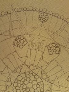
Are you excited yet? When I first started this mandala, it was very late and I was just trying to get something down on paper after having such an off year already. My original plan was way different from what it turned out to be. So like with every mandala, I drew my gridlines and basic line work for my idea. As I was doing this, however, I found that what was in my head was not coming out on my paper.

Looking at this shot, you can see the beginning of this creation. This is the point where I thought that using the circles as if they were a plant or organism was the key to getting this mandala off the ground. I quickly got stuck on what would go between the circles without it looking too busy. What goes better with weird orb-like flowers than tentacles?

After I played around with this look in pencil, I inked it in and added just a pop of color. Adding this color just blew my mind and gave me the inspiration I needed to continue on. What do you think so far?

The gradient was really cool and making the orbs a darker green was the best thing I could do to really make them noticeable. After I got all the orbs colors, and boy were there a lot of orbs, I moved on to the petals. I knew that I could not make this whole thing green because then certain features would wash out. So that’s what I opted for my second color to come into play! Orange!

That was it, I knew I was well on my way to completing one of my favorites to date! It was so unlike every other mandala I had seen and it was my own creation. Am I getting you excited yet?

After adding white gel pen and yellow color pencil, that was it, I knew that it was complete. The one thing I always do is sign my artwork on the lower right-hand side, but only if it is complete. I would love to know what you think about this first mandala. Once the collection is complete, I will get scans of them so you can see the true color in each one.

Christmas Presents!

I know I know! Christmas is already over, but now that all the gifts that I made have been well-received I thought I would share them with you. Each year I love to give gifts that I have created. I love to create something that makes them think of me and the memories we have together when  they see them. They are also personalized so that they meet the needs of the person and their tastes.

Ok, I want to start off with one of my favorite type pieces. A very dear friend of mine went through a tough time and didn’t believe that they would get through it. However, after they rose from the ashes of that destruction, we started to talk about how they were like the Phoenix. Every year, I give this friend something that goes along with the theme of rising above your circumstance and setbacks. Each year is a new beginning. You can check out last years here. And the one for this year was a beautiful staff, since we are both nerds, that is designed after the Phoenix.


This was drawn with my black .03 Staedtler Pigment Liners, and colored with red, orange, yellow, grey and brown Steadtler Color Pencils. I then decided that taking the grey color pencil and rubbing it lightly over the outer edge of the paper gave the whole thing a new look. Overall, I’m happy with how this turned out and have already started researching phoenix ideas for next Christmas. If you have any ideas, I would love to hear them.

Onto the second gift, I was gifted a smaller lazy susan. It was made from bamboo, but had some apples painted on the top of it.  I wanted to do something very personal for my sister-n-law and her new husband. I knew that they would appreciate a handmade gift. So, I had my fiance’ sand down the top and it left a beautiful finish. Then, I started working from the inside out. Starting with the first letter of her new last name, “S.”

After surrounding the monogram with a very detailed mandala, I then erased my guidelines (still in the picture above) and put two clear protective coats on it. On the night we gave this gift, It was immediately put to use under the salad bowl in the center of the table.

The last, but certainly NOT least, gift that I made personally, was for my fiance’s parents. They have been such a wonderful blessing in my life and I wanted to give them something that represented family and unity. So, like the last gift, I chose to do a monogram again, but with my fiance’s parents last name letter “L”. But unlike the last gift, I chose to paint this on a black square canvas that I had.

I decided that using my gold paint pen from my table project gave this piece the life it was searching for. I absolutely love how it turned out and they seemed to as well. I am truly blessed to be able to share my talents with those around me.

Although these were not the only gifts I gave for Christmas, they were the most personalized gifts and I wanted to share them with you. Please let me know in the comments below, which was your favorite and why. I would also love to know any ideas you may like to see in the future.

Bullet Journaling – Refresher

If you haven’t heard of bullet journaling, it is a minimalists way to schedule your life. This is a system that combines several of your journals, schedulers, and calendars into one easy to keep track of book. Or so they say. Now before you get offended, hear me out. I tried this system back in November of last year, you can read that post here, and I failed.  My failure had nothing to do with the system and more to do with my perfectionism. I wanted beautiful spreads and amazing visuals on each page. Eventually, it became too much with the holidays and I never made it to December. To be honest, I don’t even know where that notebook is currently.

Now, lets discuss why this system failed for me. There are several reasons, some of them mental and some of them physical. These range from not having the right notebook, to not making the time, and not putting forth the effort. “Oh, I don’t need to write that down, surely I will remember it!” Famous last words. I never did remember it and I never did write it down.

Excuse #1: Not having the right tools.

Now, don’t think that you have to have the most famous bullet journal or the most expensive pens and products to do a bullet journal. You just have to be happy with what you do have. You can just use a composition notebook and a bic ballpoint. You don’t need the fancy supplies to get started, and honestly, I wouldn’t go out and buy them until you have created the habit.

However, in my mind, I didn’t have the right supplies. I didn’t want to use the inexpensive supplies I had on hand because I have to get excited about a new habit, or it won’t form. If I don’t have crisp, clean notebook and a pen just for it, I won’t be happy long enough to continue.  So, I bought the Leuchitturm 1917, which is like the official bullet journal. I did not buy pens for this, because I already have my Staedtler Triplus Fineliners that I love and work perfectly.

[amazon_link asins=’B06XPP3SPX,B003EVLFJM,B002TSIMW4,B00SBDMNEE,B002CVAU1Y,B01N8ZXUX7,B003VZR1PI,B003EVHV6S’ template=’ProductCarousel’ store=’rafrti-20′ marketplace=’US’ link_id=’08a6aeb8-7160-11e7-9303-9bfd195b4d23′]

Excuse #2: I can’t make my spreads look like those on Pinterest

This is a very very common misconception. The spreads are beautiful, and one day, I will get there. But it is better for me to form the habit with the minimalist attitude. So, here is a picture of my year at a glance spread below. You will see that I just made it simple. I also added a thin piece of washi tape across the top, not even perfectly lined up *gasp*, so that i had a quick reference to jump back to. *personal information is blacked out*

I decided to only do 6 months because that would carry me to the end of the year. When the next 6 months arrive, if I am still doing bullet journaling, I will add it to it then another 6 month spread. Besides, who wants to get bogged down on trying to keep up with a full year at once. Guess what else? I only used black and white on this page. I want to get into the habit before I learn new ways to create the same spread. I highly recommend this way of thinking.

Excuse #3 – I don’t even know what I should track or that I want to track.

If you look online, especially Pinterest, you will find a huge list of trackers. But I say NAY! Don’t get bogged down with all the trackers available. Add trackers as you want to, and how you want to. Throughout the process you will find that you will come across things that are important to you specifically that you want to track. For me, I want to track my 100 mandala challenge! This challenge is important to me and something that I want to complete before the end of the year. Here is a look at how I am tracking this, in my 2-page tracker spread.

As you can tell, I drew  a simple mandala and also included the website where I got the challenge from. I then write a date on the number and color it in. This is my favorite spread so far. It appeals to my artistic side, as well as my need to track this challenge.

Excuse #4 – I’m too depressed/anxious about keeping up with something else.

Yes, depression and anxiety is something that we all have to deal with at one time or another. Some of us even struggle enough to be medicated. But that is what is so great about the bullet journal process, if you miss a day or a week, you can jump back in and there are no predetermined pages that you use up. You determine how and how much you use your bullet journal. I decided to try to list all the things that make me happy and put it at the beginning of my journal. This ensures that even on the days that are considered my lows, I have something to keep me from going under. Take a look at this below.

Excuse #5 – I’m too busy

Honestly, we are all too busy if we believe it, but the truth of the matter is, we can make time for anything! After planning out my first two weeks, I saw just how busy I wasn’t. I was too busy to add work, but not too busy to add fun. So I knew by looking at these two almost blank weeks, that I would see just how much time I really had to play with. Of course, I didn’t mark down all the ER visits and power outages and mom life with many many kids, but outside the home, I didn’t have much obligations. My next step is to track my hours, find out where everything goes. Check out these two weeks below. As you can tell, they are all really really simple.

So as you can tell, I didn’t want to do anything too crazy and I wanted to keep my trackers simple. At the beginning of each week, I also track my social medias. This shows me if I am doing a good job or if I need to work harder. Because I am just starting out, I feel like my numbers are embarrassing, BUT everyone has to start from the bottom.

I hope you enjoyed this walk through my bullet journal. Remember, you don’t have to wait until January 1st, to start. You can start in the middle of the month like I did. The objective is to start somewhere. Do you bullet journal? How successful are you with keeping it up. I would love to know your bullet journal experiences in the comments below!

July 2017 Sketchbox Grab Box

So, here is a special treat for you. I received the Grab Box. Now because I am new to Sketchbox, I am not sure how often they release Grab Boxes, but according to the website, it sold out in a matter of days last time, so I pre-ordered mine. Boy was I surprised when it showed up. It was heavy and you could tell it was packed with a lot of great products!

Usually, I do my unboxing straight on the camera, but because this was a special box, I wanted to make sure I did my research on the products. I’m happy that I did open it because there was no product description card. So, let’s go through everything that came inside. The box cost $49.00 and I didn’t pay to ship.

Cretacolor Oil Pencil Pocket Set-6pk – $16.55

Zig lean Color Real Brush Pens, Deep Color Set, 4pk – $11.22

KUM Wedge Sharpener – $4.13

Spectra AD Twin Marker – Tan (087) – $9.67

Generals Charcoal – 2pk – $4.83

Derwent Blender & Burnisher – $9.73

2 Zig Art & Graphic Twin Markers – $13.26 ea

Ironlak – Permanent Marker 0.4mm – $4.00

Fabriano Ecoqua Notebook – $7.76

Tombow Color Pencil Set Recycle Tin – 12pc – $14.99

Prismacolor Scholar Kneaded Eraser – $5.12

Faber-Castell Eraser Pencils 2pk – $6.00 (Blick)

TOTAL = $120.52

Now, something I should mention is that I priced all of these items according to Amazon.  The only thing I couldn’t find on the Amazon Website was the Faber-Castell Eraser Pencil pack at the bottom of the list. With these prices, I saved $71.52 on art supply products of high quality. This is a great deal for anyone who wants to try something new and challenge themselves to use new products. You never know if you are good at the different mediums if you never try them. Ok, let’s go through each product now.


Cretacolor Oil Pencil Pocket Set – 6pk – $11.55

[amazon_link asins=’B005Z469K6′ template=’ProductCarousel’ store=’rafrti-20′ marketplace=’US’ link_id=’50fc98ff-6dbc-11e7-b6b3-21d52b4f1d30′]

I have never used Oil Pencils so I will have to research how they work before I can give you a review. But according to the information, they will not smear and are effective on multiple surfaces. The six colors that came in this pack are classic white, sanguine, sepia light, sepia dark, nero-soft, nero-extra soft.

Zig Clean Color Real Brush Pens, Deep Color Set, 4pk – $11.22

The colors that came with this set are Dark Pink, Deep Blue, Olive Green and LIght Brown. I have tried these only to show the colors. I did notice that they did not bleed through the Fabriano Sketchbook that also came with this box. These brush pens claim to be blendable, but I have yet to blend them.

KUM Wedge Sharpener – $4.13

This sharpener is not like the average sharpener you get for everyday pencils. The feel of this is so nice, as well as the fact that it comes with an additional blade screwed into the side for when the initial one gets dull. This sharpener is made of magnesium alloy and made in Germany.

Spectra AD Twin Marker – Tan (087) – $9.67

This product looks like a Copic marker in that the barrel is shaped with flat edges to prevent it from rolling off the table. It claims that the cap matches the ink closely. When I tested this ink out on the Fabriano Sketchbook included in this box, the ink bled horribly onto the back side, I am not sure if this pen requires a different type of paper or if it just drops a lot of ink. Until I have a full set and can experiment with different types of paper, I can’t be for certain.

Generals Charcoal – 2pk – $4.83

Let me put out a disclaimer to let you know that I have never used charcoal before, however, when I used them to test them in the sketchbook, I found that they act just like I would think charcoal would. It smeared and smudged and ended up all over the side of my hand, but the color was smooth, rich and intense. The two I got were 2B and 6B, but it comes in HB, 2B, 4B and 6B.

Derwent Blender & Burnisher – $9.73

I tested the blender out with the color pencils that we will mention below and I have to say that I was pleasantly surprised with how rich the color pencil was after using it. I haven’t used the Burnisher and if you know exactly how I would love to know in the comments below.

2 Zig Art & Graphic Twin Markers – $13.26 ea

I got two beautiful colors. Sky Blue and  English Lavender. These look like they are going to be fun to use. I thought about using them in my bullet journal because I thought that maybe with the muted colors, it would be pretty, but when I tried them out, they showed a little darker than I thought they would. These will require more testing before I can really let you know what I think.

Ironlak – Permanent Marker 0.4mm – $4.00

I used this in the sketchbook and it bled through. This reminded me a lot of a Sharpie, the way it bled through the paper, and yet it was very rich in color. I did not really see anything that sets this permanent marker from any of the others on the market.

Fabriano Ecoqua Notebook – $7.76

Let me tell you, I was so skeptical of this sketchbook. I thought for sure that everything would bleed through the pages because they seemed thin and very smooth. I received the Rasberry Color, 40 pages, 5.8″x8.25″, 85gsm/60lb plain sketchbook. It was made in Italy. After using all the different products, which I will show you in my art supply review, I was pleasantly surprised at how well the pages stood up against the testing. The pages are extremely smooth and I used mixed media to create a full art piece.

Tombow Color Pencil Set Recycle Tin – 12pc – $14.99

Beautifully crafted with recycled cedar wood and finger joint technology which reduces waste and conserves our environment and forests. Lead is hard and dense for precise details and sharp lines, strong pigment for deep color saturation, blending and layers. Set is packaged in a reusable metal tin. Even though Tombow is a Japan-based company, these were made in Vietnam.

Prismacolor Scholar Kneaded Eraser – $5.12

I have seen a lot of artists using kneaded erasers, so I was excited when I saw this in the box. Kneaded erasers can be molded and shaped in any way so that you can erase fine lines or wider lines. It can be used with chalk, charcoal, pastels and color pencils. Once you have used the eraser, all you have to do is knead it like clay for it to clean itself. Therefore, these erasers tend to last a while. Eventually, you will have to replace it, but really the price is so low, I wouldn’t hesitate to buy a few.

Faber-Castell Eraser Pencils 2pk – $6.00 (Blick)

So I get the concept of this and I have always wondered why there wasn’t an eraser that was just as fine as the line you were drawing. Well, now there is. I watched a video where the artist claimed that these erasers were amazing for him because he worked with very fine details. He claimed that although he had several kneaded erasers, they just didn’t get as fine as these did. These erasers are ideal for erasing graphite, ink, India ink and ballpoint pen. It is soft for smear-free erasing. I could not find these on the Amazon website, but Blick does have them for the price mentioned above.


So, there you have it! A detailed description of all the items that came in July 2017 Grab Box. Be on the lookout for the next one as they sell out quickly. I know I will be purchasing the next one when it comes available.  All in all, I feel like this box was very much so worth the price. Everything in this box is something that I will use in the future.  If you would like to get your hands on this sketchbox, or any in the future, please use this link so that I can get a credit to use towards next month’s box.

July 2017 Premium Sketchbox

Every month, I receive a Sketchbox. This month, I have the premium box for $35 plus $5 shipping. The basic box is $25 plus $5 shipping. When you look at all the products inside, they all retail for around this. Now there are things that come every month, this includes; Sketchbox Sticker, Artist of the month box, Artist of the month tile, and a product description card. I will go through each of these items in detail below so that you can see what you get for the price. This is my second month getting it. If you don’t want to read this post, you can watch the video below of the un-boxing here.

In every box you get a special inspiration piece from the featured artist of the month. The artist creates something from everything that is offered in the box each month. You can read more about the Artists of the month by clicking here. This month we received this gem:

Ok, let’s get started on everything you get in the box and I will have pictures to give you a good look at each product. First off, let’s take a look at everything you get.

Staedtler Triplus Fineliner 10 set – $18.00

Custom Alumicolor Pocket Scale – $6.75

First Look – Derwent Precision .7mm Pencil – $9.99

2x Derwent Procolour Pencils – $2.89/ea

Sakura Microperm .45 mm – $2.79

Total Retail: $43.31

Staedtler Triplus fineliner 10 set – $18.00

“These fineliners offer a super fine 0.3mm porous point. which are protected from damage by a metal-clad tip which make them perfect for using with your new alumicolor pocket scale!” – Product Description Card

First off, Staedtler is like my go-to brand when I look for pens to create art with. Last year for my birthday, my now fiance’, purchased a set of 36 colors. Immediate I fell in love with all the colors and use these pens for anytime I want to add color. I also love to use them when coloring fine details because the time is the perfect size for that. In my opinion, you can never have too many of these pens and I am always excited when I see them in my hands.

CUSTOM Alumicolor Pocket scale – $6.75

“We partnered with Alumicolor to bring you this custom Sketchbox edition pocket scale! Alumicolor rulers are more than just functional pieces — they’re durable and beautifully designed professional tools. The scale itself is anodized into the ruler’s surface rather than being printed or etched, so that it never wears off.” – Product description card

This is a product that I haven’t ever used before, but I have an idea about what I want to do with it. Because it is so durable and comes with its own case, I thought this would be the perfect tool to add to my on-the-go art supplies that I like to keep with me in my purse. I pull out these supplies when I complete my Lunchtime Challenges and when I have a few minutes to create.  This is the perfect addition to that collection because of its size and the measurements at a glance.

Derwent Precision .7mm – $9.99

“We partnered with Derwent to give you the exclusive first look at their new mechanical pencil. The Precision Mechanical Pencil features a premium metal barrel and a high quality comfortable hold. This pencil is designed for detailed line drawing or technical work” – Product description card

I am always on the lookout for a good mechanical pencil.  I doodle a lot and typically I just use anything I can get my hands on, but that usually consists of a pencil that I need to sharpen, with the eraser worn down. This is going to be great for me because it is a very nice pencil. Holding in my hand, it has weight to it that tells me that the product is well built.  The weight is balanced and isn’t heavy on either side. I decided that I was going to tape the extra erasers to the extra lead that came with the pencil so that I always have them together.

Derwent Procolour Pencils – $2.89/ea

“The brand new Procolour range of colored pencils feature a strong pencil core with a smooth formulation and highly pigmented color laydown. These pencils offer increased blendability while maintaining a very strong core.” – Product description card

Being in America, the first thing I noticed is the spelling of color. I know that these color pencils are made in Britain so being spelled colour makes sense. That is just my ocd about spelling that comes out. Moving on, for these pencils to not come in a package, the tips were still fairly sharp, which makes me feel like they are fairly durable. I used them on some bright white cardstock so that I could see the colors and how they came out on paper and I’m pretty impressed with how the color on paper is extremely similar to the color on the pencil is what actually comes out on paper. As far as blending is concerned, these two colors aren’t the best and I wouldn’t typically blend them. So I wasn’t very impressed with the blending of these pencils.

Sakura Microperm .45 mm – $2.79

“Permanent micro-point ink pens that draw ultra fine lines. They will write on most surfaces, are quick drying and waterproof.” – Product description card

Sakura is a well known brand in the art world, especially if you know of zentangle practices. The various tips are so useful when trying to design different details. I tried writing with this on card stock and it didn’t skip wrote beautifully, however it did bleed. If I were to leave the tip in any place for any amount of time, it will create a circle that is bigger than the line.  I also wrote on the skin with this pen and it wrote perfectly. It didn’t smear or bleed out, the lines were really perfect.

All in all, I feel like this box was very much so worth the price of the premium subscription. Everything in this box is something that I will use in the future.  If you would like to get your hands on this sketchbook, or any in the future, please use this link so that I can get a credit to use towards next month’s box.

Collaboration – Jeanne Burbage

I wanted to share this collaboration I did with Jeanne Burbage. She is an incredibly talented artist from Canada. She offered up this Valentine’s Day doodle for her fans on a Facebook group I belong to, Lines & Designs, to color. This is my coloring of her doodle, and although I rarely color my own doodles it was very fun coloring on hers. I used Staedtler Color Pencils found in the clearance section at Wal-mart of all places.

Please visit her website here and buy her coloring book. There is a wonderful flip through of her coloring book on YouTube, please check it out! She hopes to have a new book out in March. She also has a Facebook page here. Always remember to show your support for artists.

Gift – Teal & Blue

I have a dear friend who is in love with teal and blues. She is also an artist friend of mine and I knew that she would appreciate and one of a kind art piece for her home. I had so much fun drawing this and perfecting it. it was worth all the time and energy when I watched her reaction when she opened it.

I am so blessed to have people in my life that not only appreciate my artistic abilities but encourage them as well. This special lady is just one of those mentioned.  Here is a close up so you can see the detail and shimmer in the finished product.

Adding Color

As my readers know by now, adding color to my art is always stressful to me. I love leaving them black and white because I love seeing what other people see in the picture without me guiding them to one thing or another. This was no different.

I had created this drawing about a week ago. I was just sitting down and doodling and this is what happened. It just came to life on the page. I belong to a few groups on Facebook specifically geared towards art and Zentangle in nature, and they suggested that I color this one. The few friends I showed also suggested I color it.  Here is the before.

I have to admit, the outflow of compliments on my colored piece made me feel a little more confident. I wanted to drag the colors across the page instead of having one color on one side and one color on the other. So I made sure that I tried to balance the colors as I used them.

I am very interested in your constructive criticism or ideas on how I can improve. So, maybe I might try coloring more since this one was so well received. I would love to know what you think about this doodle in the comments below.